# Setup Step 1 Screen
Oftentimes when logging into a user-centric app for the first time, the first couple of steps are around creating a user profile. With this feature template the ‘Setup Step 1’ Screen guides users through the process of filling out user specific profile information.
## The Components
### **Header Group**
The Header Group is a visual way to let the users know where they are in the process of creating their user profile. If you are a user, you want to know how far you are in the process and what’s coming up next and this is a simple way to show that!
On each of the three set up screens, the icon color changes to denote which step in the process the user is currently at.
⚡ **Overview Actions**
* Link Action “Back” to the previous screen.
### Form Component
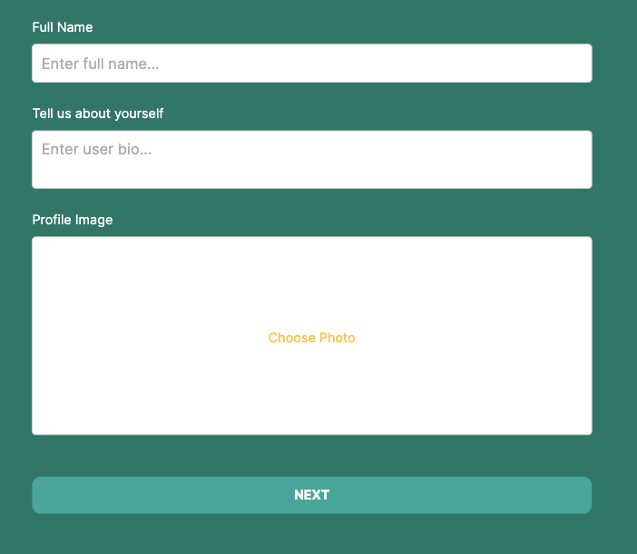
This component collects information about the user to fill in the properties within the User Collection.
There are more properties that can be displayed from the User Collection, however, this form collects information that has not been filled in during the sign up process — for example, a profile image and bio.
⚡ **Button Actions**
* Update User
* Link Action to ‘Setup Step 2’ Screen